Brand Identity & Creative Direction
Schouwse Dauw is a new Dutch wellness brand focused on bringing the healing qualities of nature into a modern, accessible form through supplements.
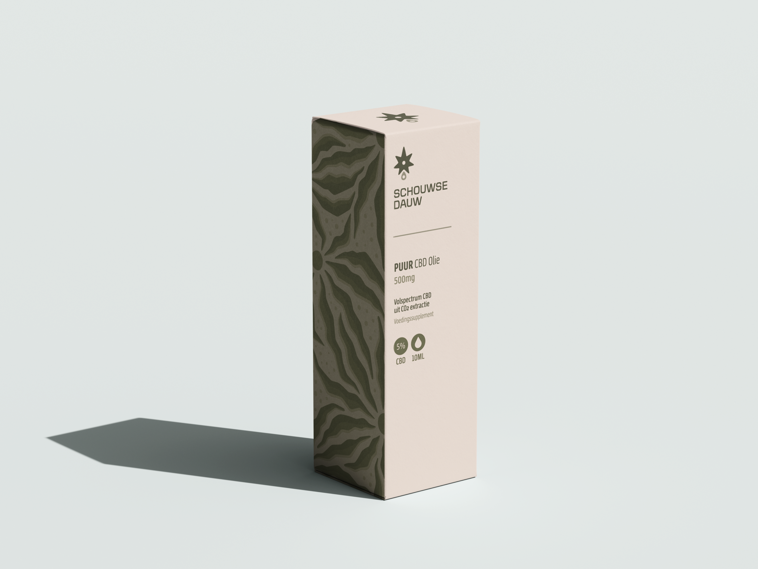
For this project, I developed the brand from the ground up. My role covered the full scope of branding, including logo design, packaging, visual identity, advertising, social media, and overall marketing direction.

The foundation of the brand is clean, refined, and recognisable, with a strong focus on clarity and consistency across all touchpoints. At the same time, I introduced a more distinctive, creative layer through a custom-designed repeating pattern system. The colour of each pattern is tied to the product’s ingredients and intended use, creating a visual language that is both functional and expressive.
This balance between minimal structure and subtle individuality allows the brand to feel premium while remaining approachable and easy to navigate.

Alongside the visual identity, I developed a tone of voice that is calm, clear, and human, reinforcing a sense of trust without feeling distant.
Schouwse Dauw reflects my approach to branding as a complete system where strategy, design, and storytelling work together to create something cohesive and memorable.
Geef een reactie